

Websites optimized for mobile phones / smartphones and tablets = Responsive Design
With mobile website optimization in the form of responsive web design, you optimize your online content in a contemporary and user-based manner. The (small) digital companions of our modern life have become true multi-functional devices. We use this technical progress as standard for all websitesandonline shops we create.
Mobile marketing is one of the most sought-after forms of advertising for large, small, and medium-sized companies. It is developing into an integral part of the marketing mix, with a responsive website / shop being the norm. We develop multimedia websites for mobile devices that complete the digital value creation of your brand. Having a responsive website created is no longer an add-on, but the standard.
The definition is quite simple: All content is geared towards the user and their mobile devices (smartphone, tablet, or smartwatch) and not vice versa!
Our focus is on the conversion and preparation of existing content for mobile devices through responsive web design. The advantage of this is that existing graphics and texts are adapted to the user without having to download an application or having to load a new mobile site. Discover the new form of active and attractive communication with your target group. Everywhere, at any time, and in real-time. We can make your website responsive or develop a new website or online shop with a new responsive layout and template.
Every website must be adapted to the variety of internet-enabled mobile phones (iPhone iOS, Android, Blackberry, Windows Phone, etc.) and tablets (tablet PCs). Not only the resolution or size of the display plays an important role, but other factors such as the type and nature are also crucial. Ranging from corresponding apps (native) to mobile pages and responsive design. The latter is the most modern and contemporary way to best display your online content. In addition, a Content Management System such as WordPress should be used.

Ihr persönlicher Berater für responsive Webdesign:
E-Mail: fi@vastcob.com
Florian Ibe
Work in a contemporary manner and optimize your website with us using a responsive design. Whether you want to responsively optimize an existing site for mobile or need a new layout.
Since March 2015, responsive websites have been preferred in Google search. Further factors such as loading time through improved image sources help with effective search engine optimization,content marketing, and online marketing. Together with a suitable Content Management System, self-management also becomes child’s play.
With us, you can have your professional WordPress website created.
Responsive Design
With the help of HTML5 and CSS3 Media Queries, we enable the flexible display of content on your website without an extra page or app.
Responsive Image
Using reduction programs and other techniques, we optimize the displayed images according to the user’s device. This can result in over 30 individual images depending on the device, saving loading time.
Responsive Text
Depending on the target group, we allow the most important part of your page, the text content, to automatically adapt to the mobile device. Font sizes and styles can be optimized specifically for corresponding mobile devices.
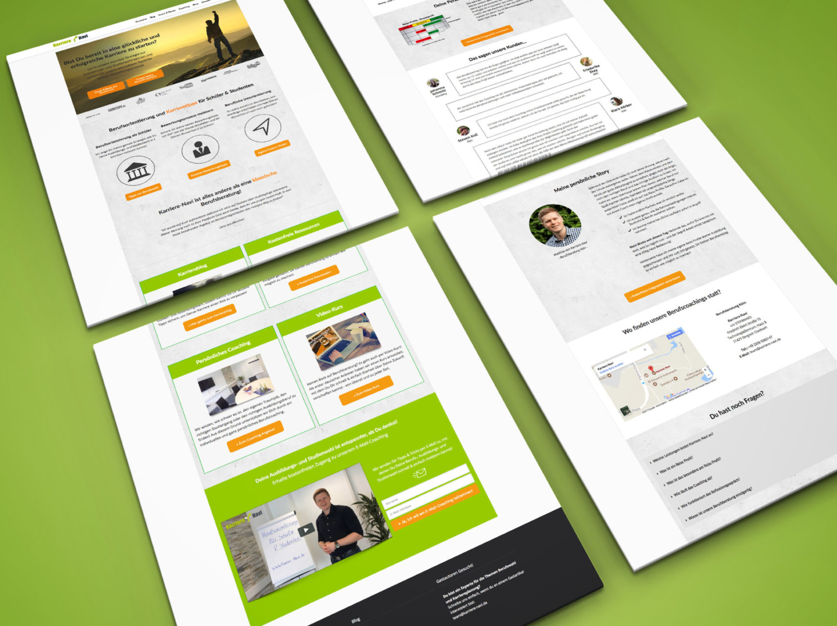
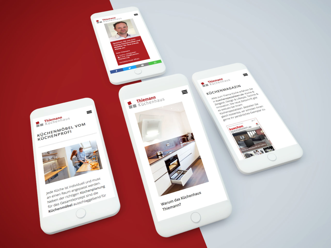
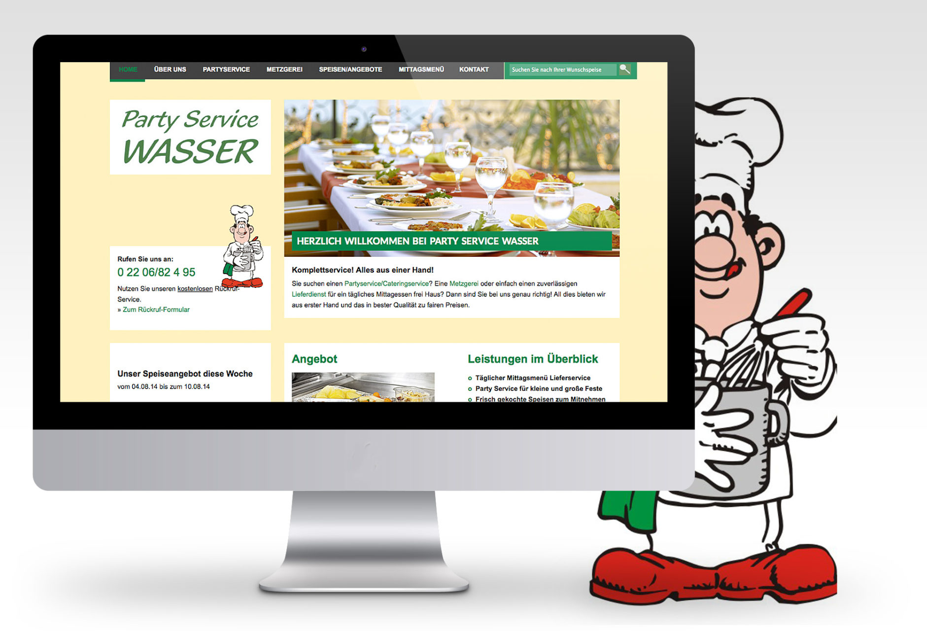
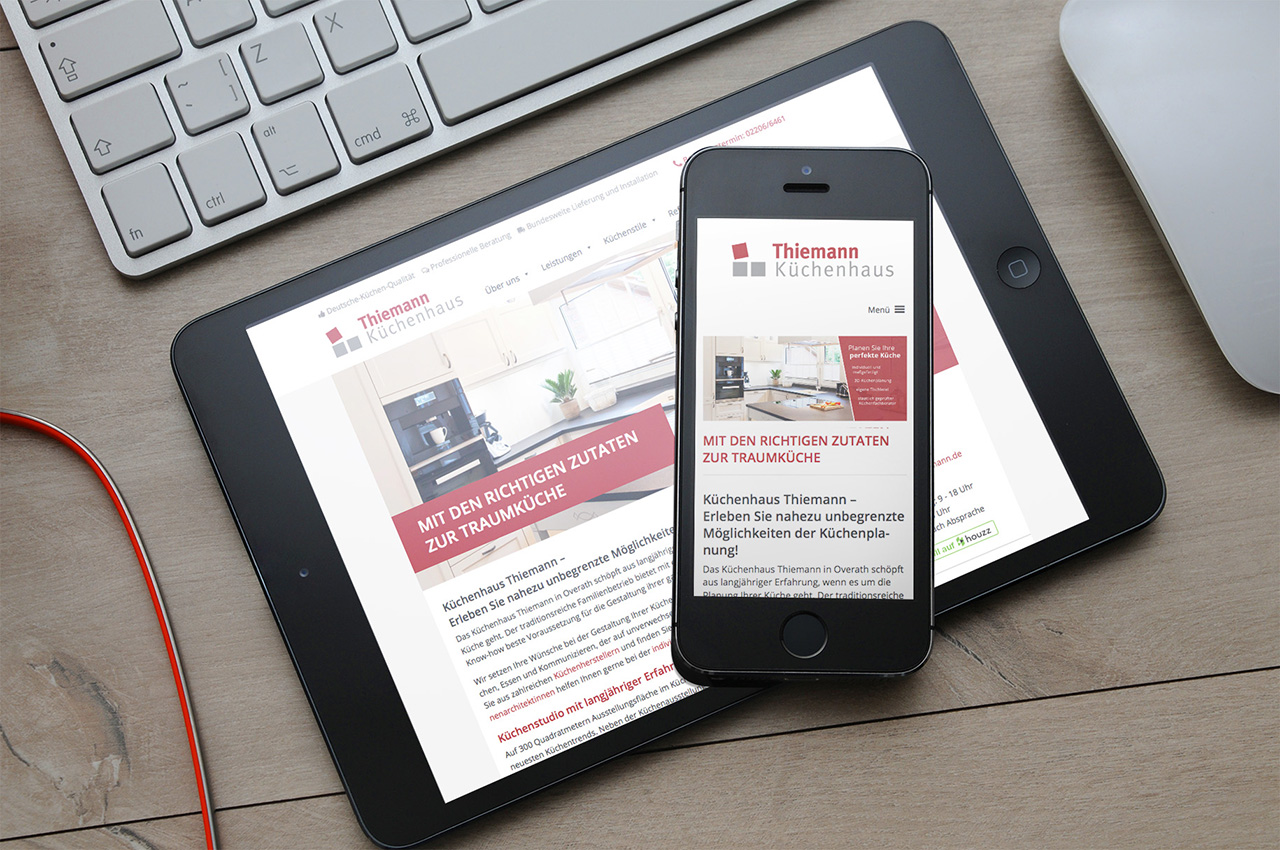
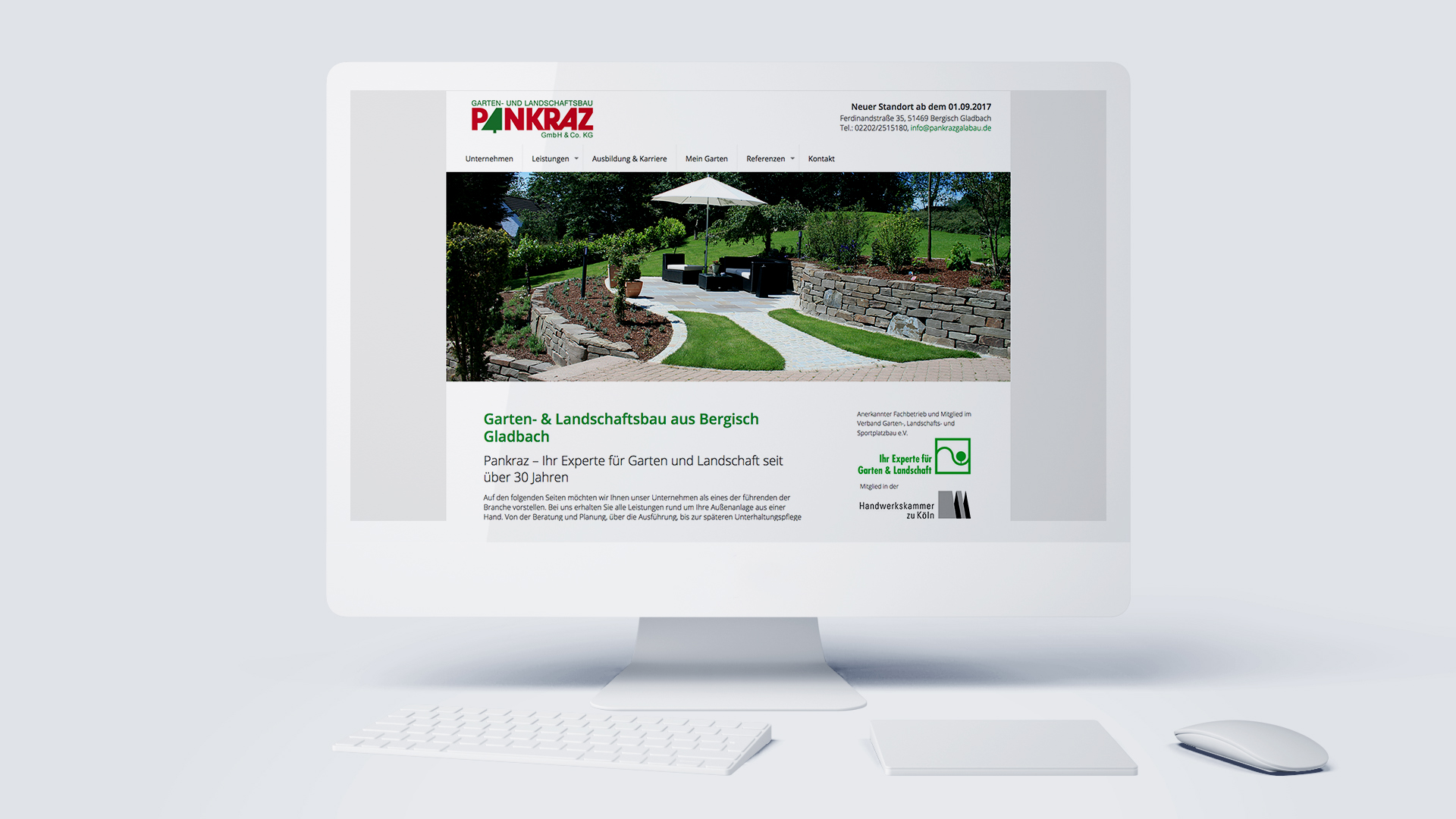
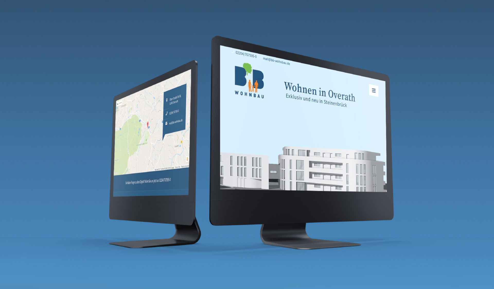
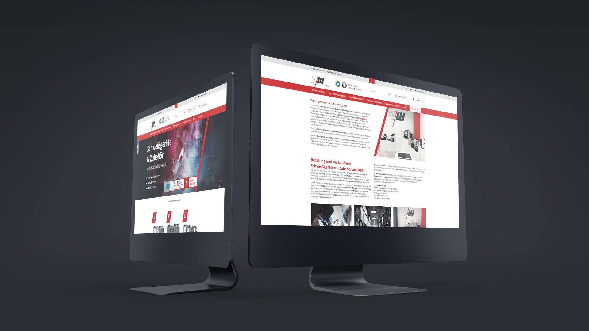
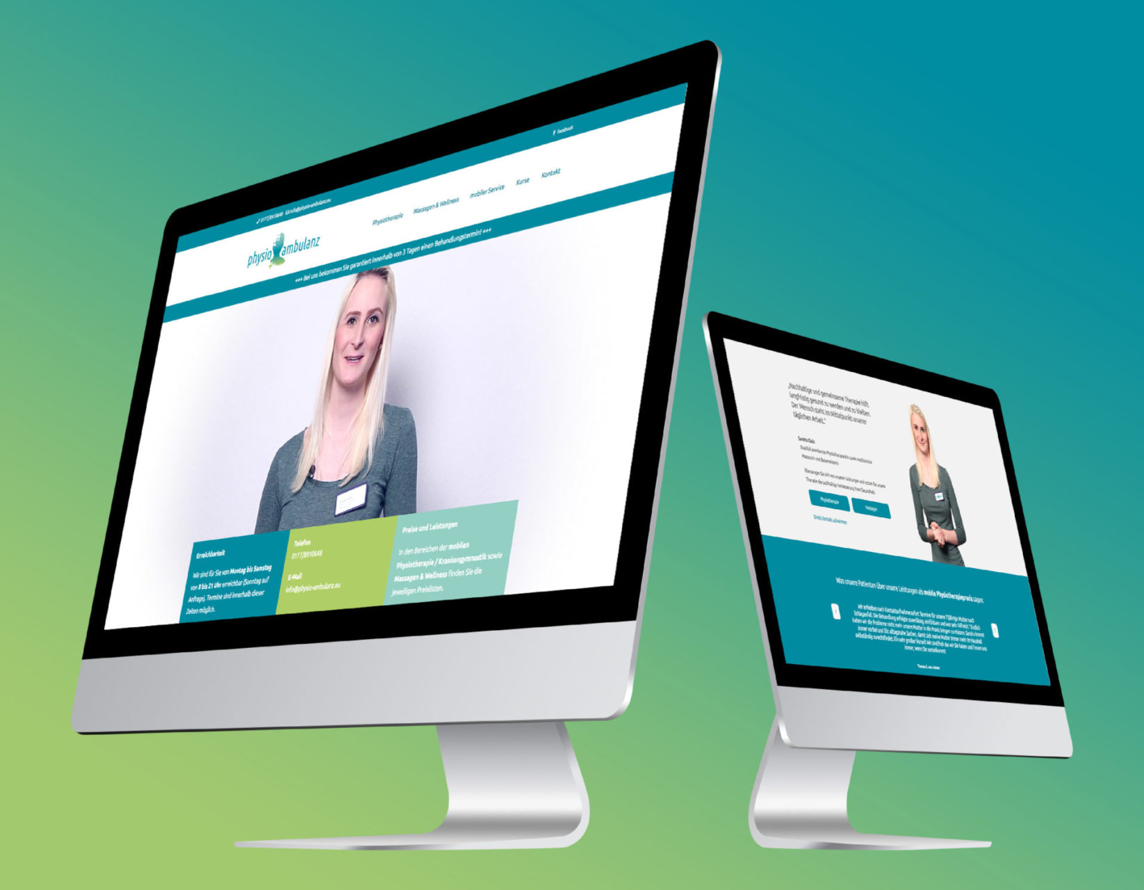

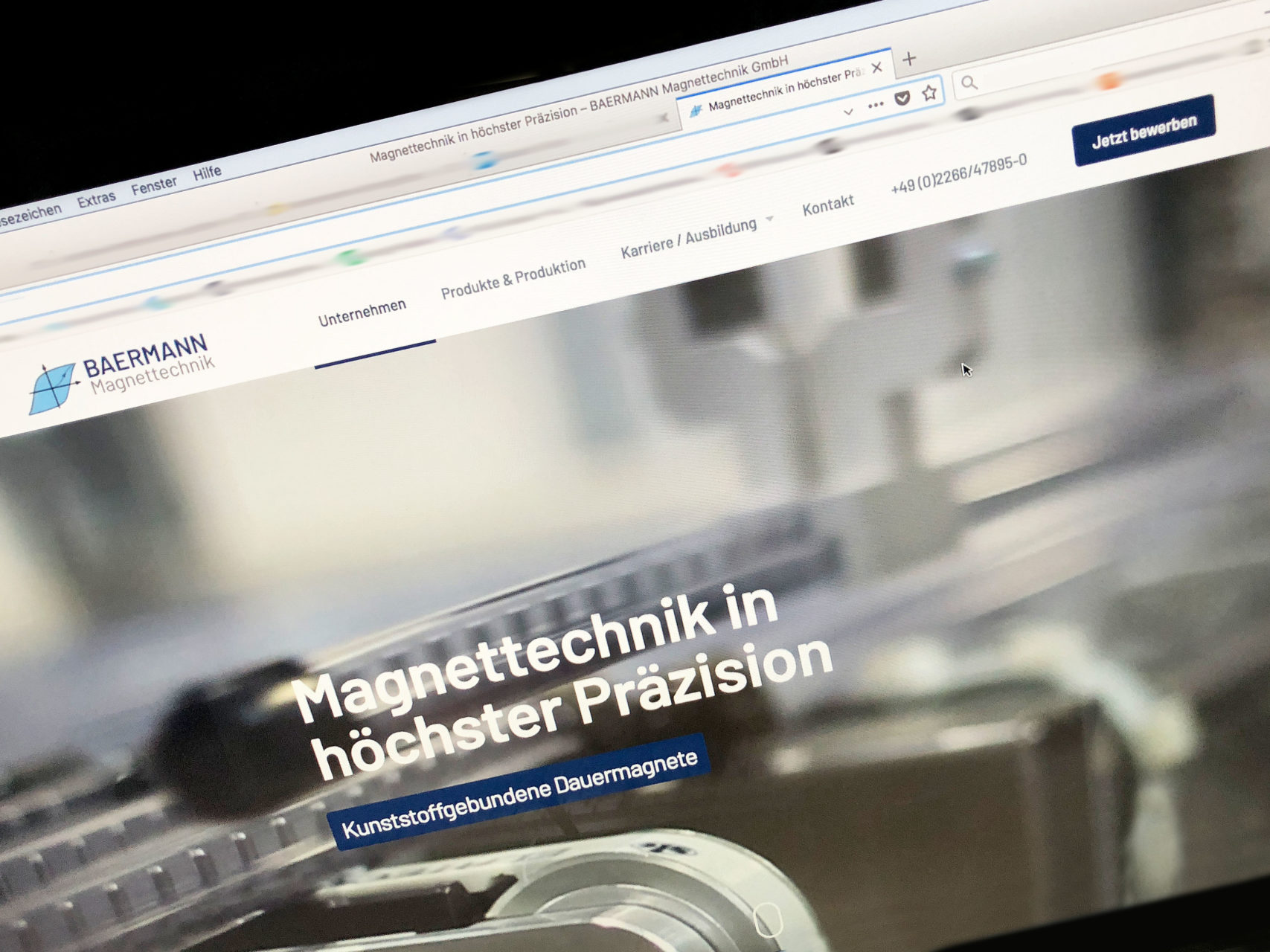
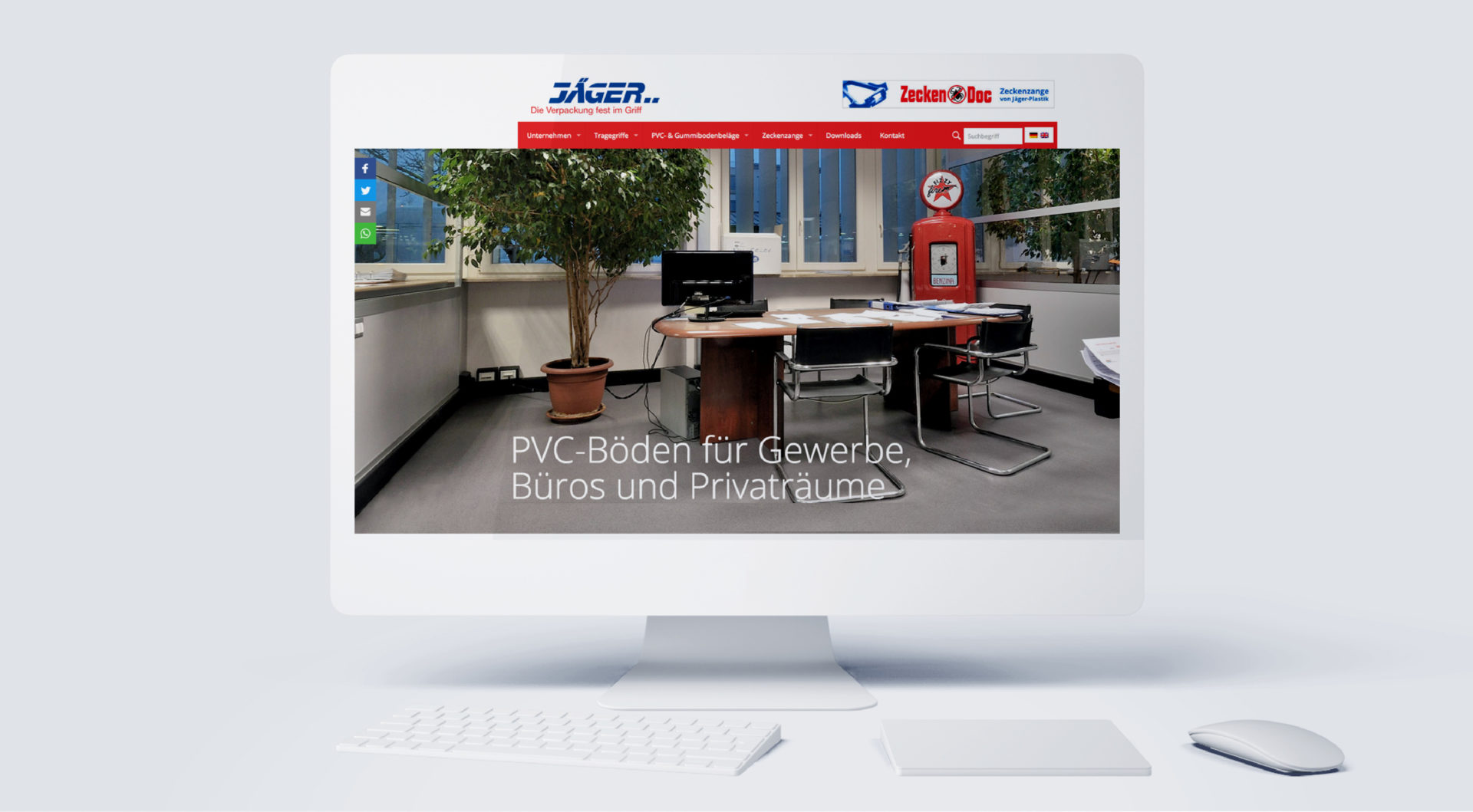
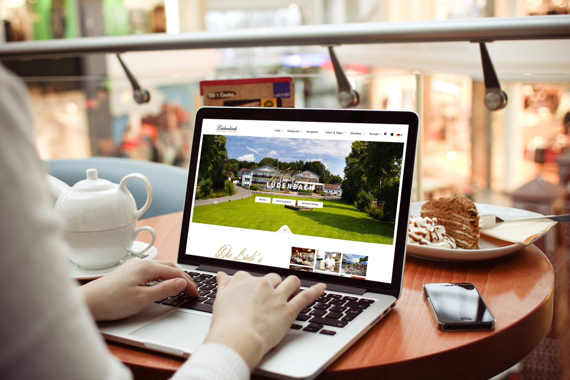
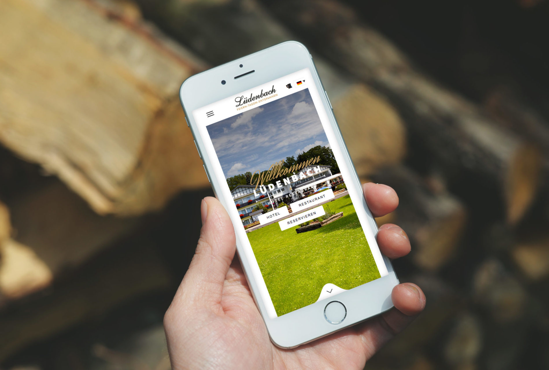
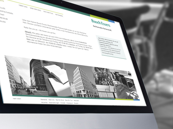
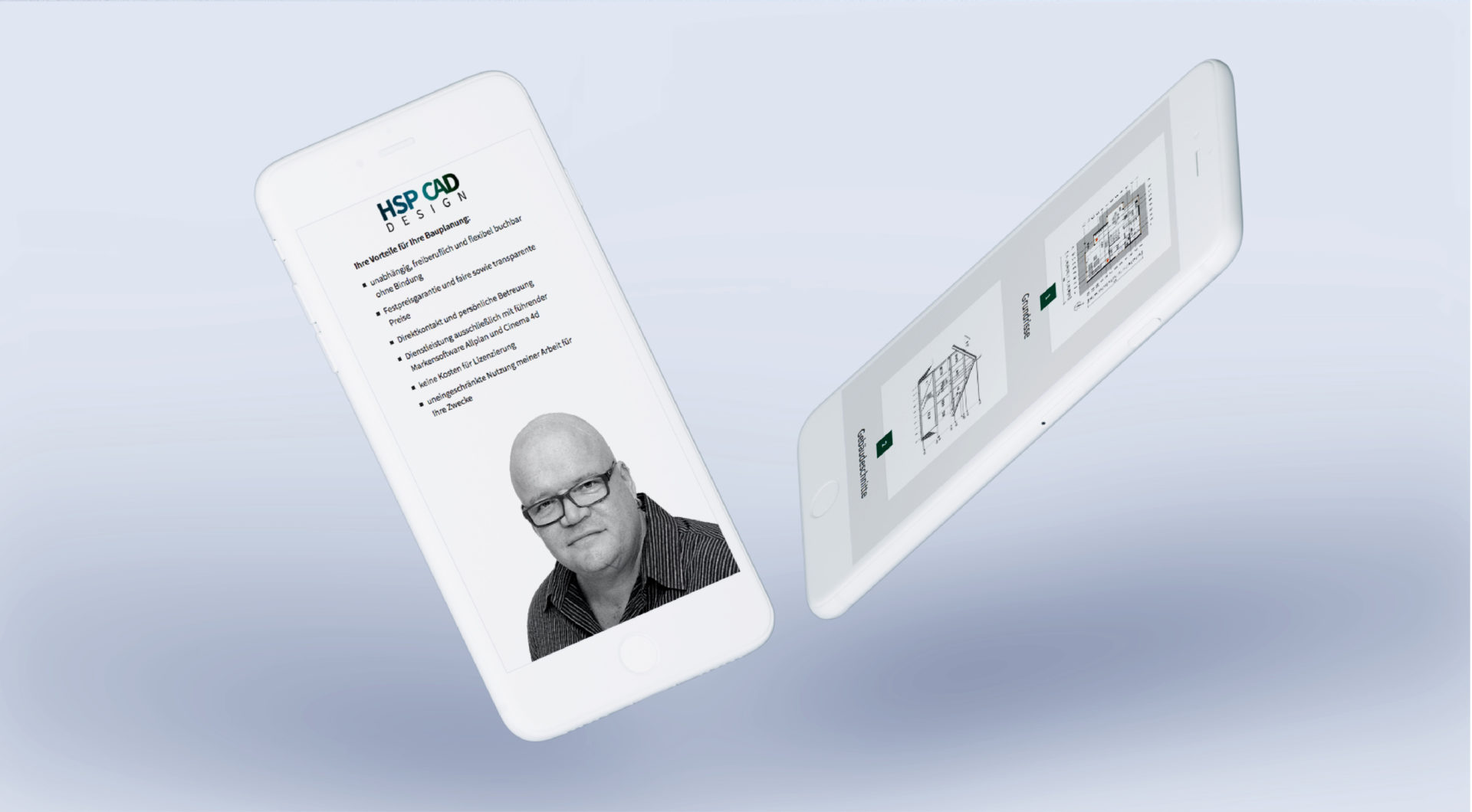
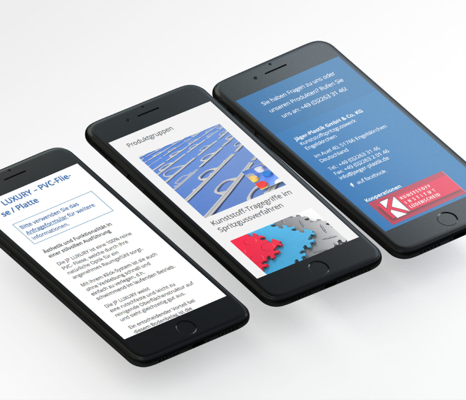
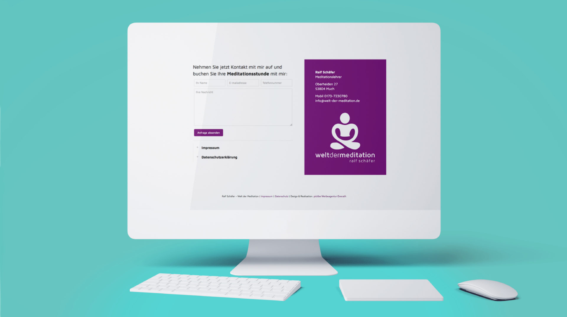
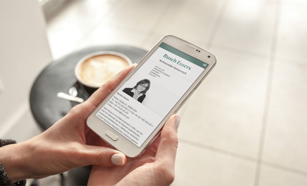
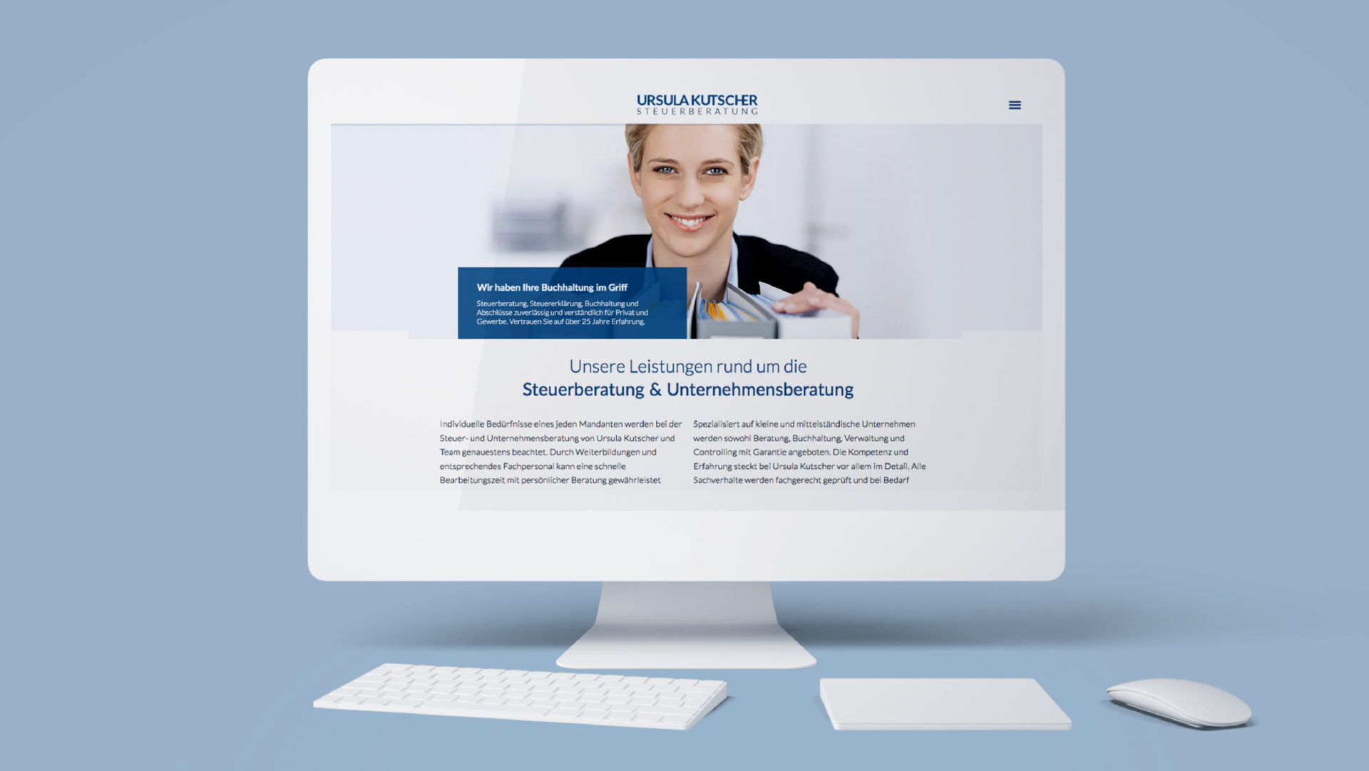
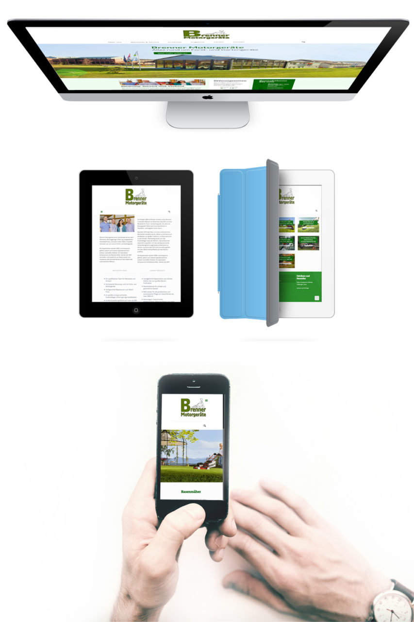
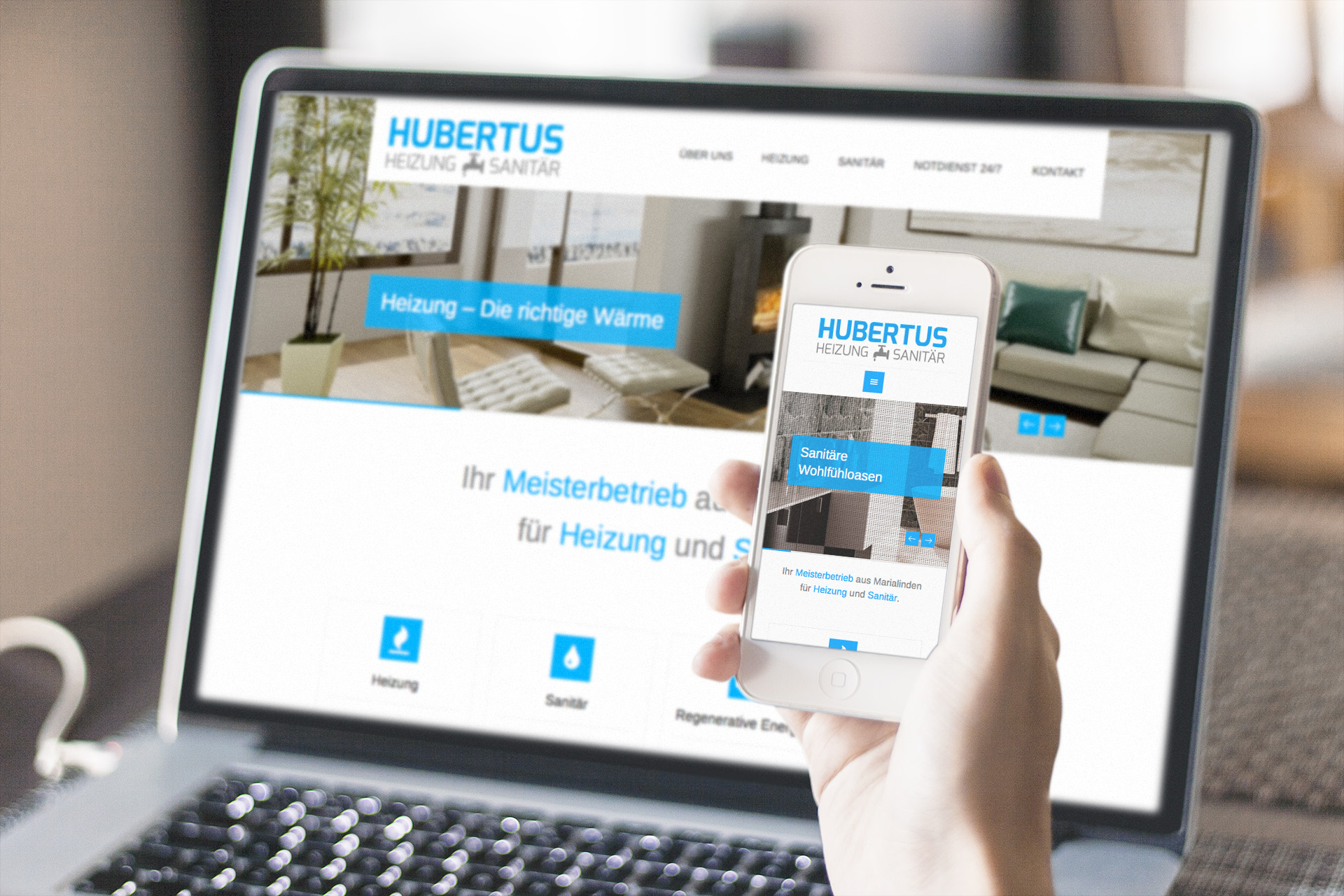
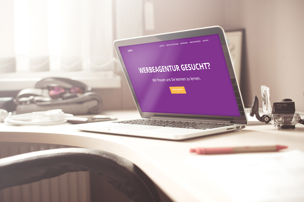
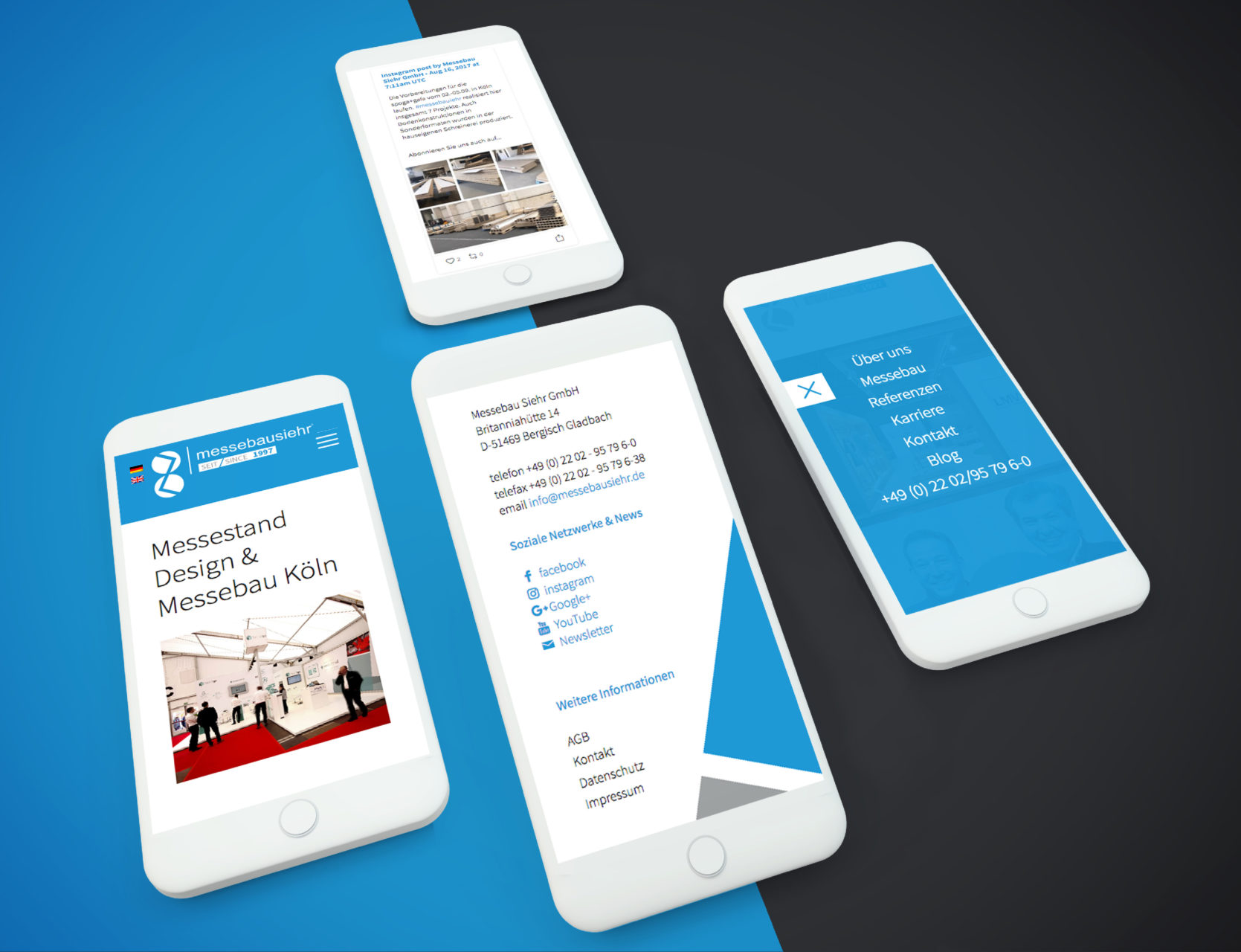
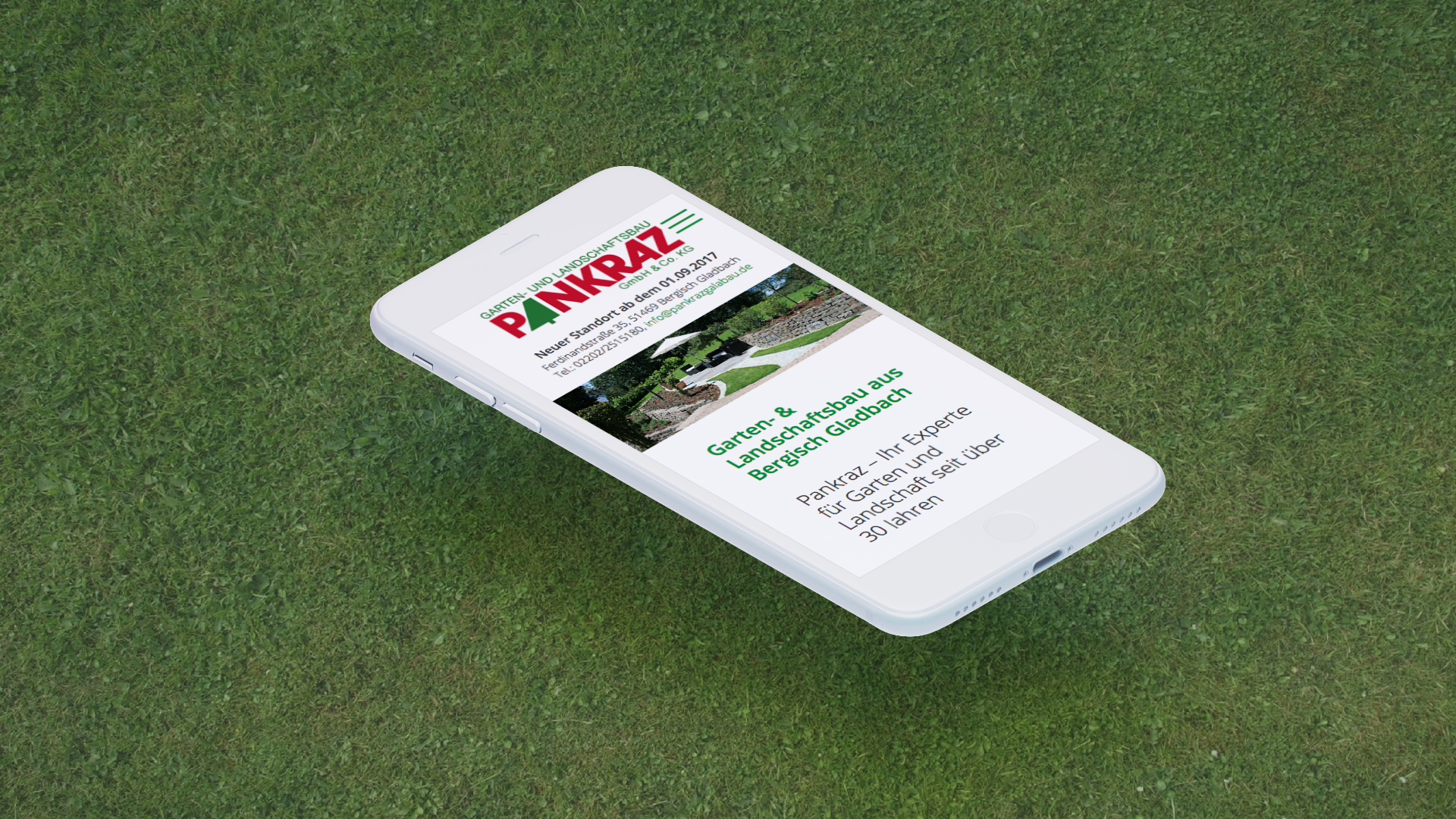
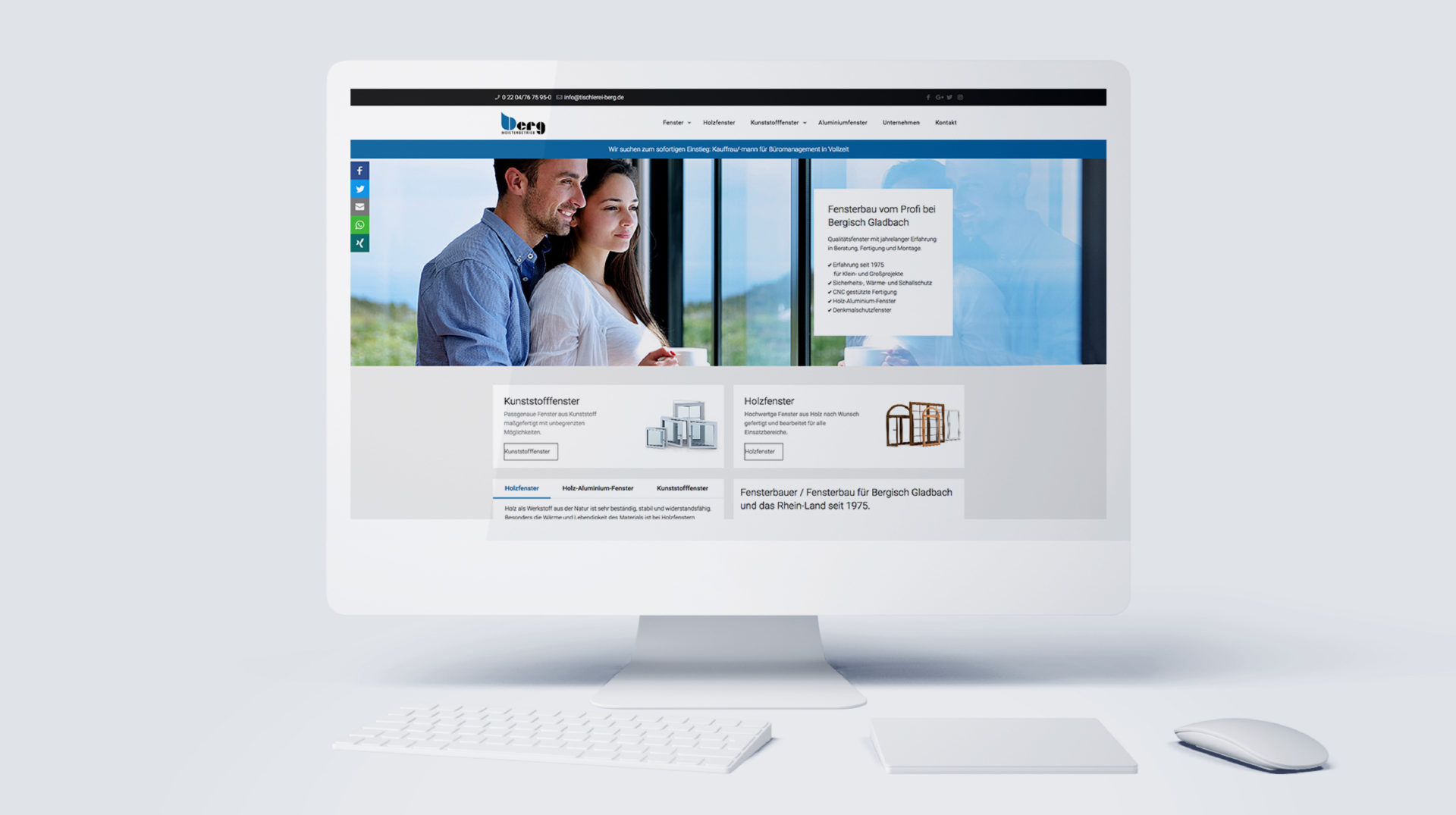



Optimize the web design for your website or webshop with us, making it responsive for mobile devices
Transparent Prices & Costs as Packages
for Web Design, Websites, Blogs, and Online Shops

 DE
DE