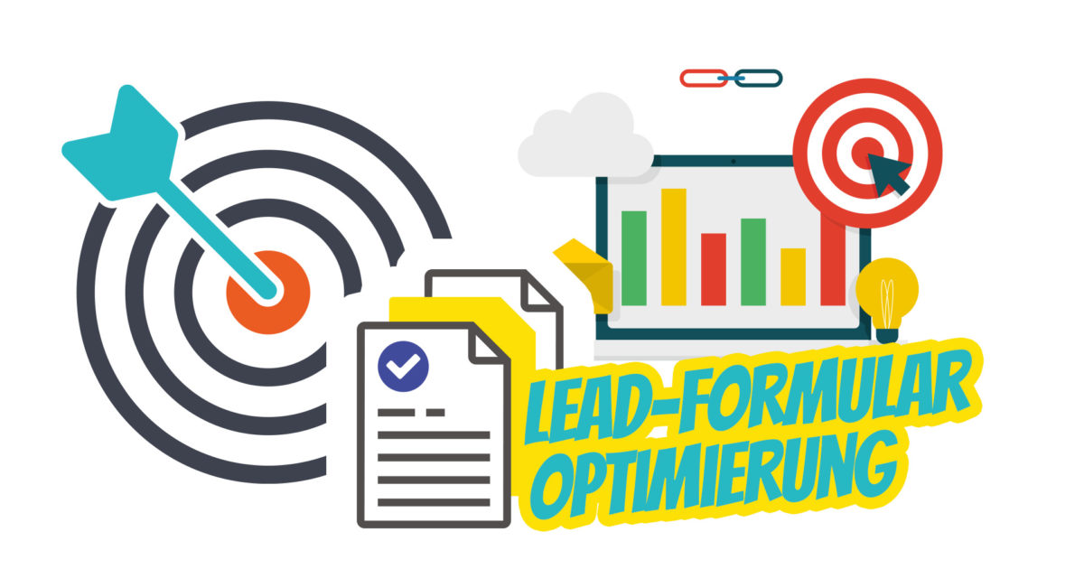
Underestimating the impact of lead forms can lead to lower conversion rates. Although a form may not seem like a problem, it is crucial for turning visitors into customers. Applying optimization techniques to your lead capture forms will optimize your conversions (leads / sales).
20 Tips for (Conversion) Optimizing Lead Forms
Here are some tips for optimizing your WordPress lead capture forms:
- Place your form above the fold
- Distract with a purpose
- Align a copy
- Ensure a strong call to action
- Keep the form short
- Consider the number of fields
- Stop asking too many questions
- Mark required fields
- Be transparent
- Have a clear message
- Make the form mobile-friendly
- Say thank you
- Ensure privacy
- Aim for design quality
- Add a personal touch
- Make your form interactive
- Include visuals
- Offer something in return
- Create pop-up forms
- Use CAPTCHAs to block spam
- Include social proof
- Create a multi-step process
- Split test
Place your form prominently above the fold
According to the study, people spend 74% of their viewing time above the fold. When a page first loads, this refers to the part of your website that visitors can see without scrolling. Therefore, any important action you want your audience to take should be placed there (including your lead generation form).
Distract with a purpose
Another proven method is to embed a form in the middle of the article, so you benefit twice: readers have the opportunity to familiarize themselves with your content, and you still collect data without irritation.
Align the form with the page
One of the key components of an effective lead generation form is its alignment with the rest of the content, such as consistency in design and language (including keyword usage). In this case, your form will have a greater impact on visitors with a compelling message that creates a sense of progression (without interrupting the flow).
Through synergistic effects, relevant calls to action, body text, and a headline are not only aligned with your audience’s expectations but also with the best practices for search engine optimization (SEO).
Ensure the CTA text is strong (and persuasive)
If your form is the cornerstone of the lead generation process, your CTA (Call to Action) is the cornerstone of your form. Your CTA should instruct people on how to perform the action you want them to take. Think of a CTA as a specific campaign with a single purpose.
A tip here: The text on your button should indicate what happens next when a visitor clicks. A small (but creative) change to the copy can massively impact the click-through rate.
Keep it short, clear, and concise
Do not indulge in lengthy forms to achieve the main goal of the form. You want your form to convert, which is why it’s so important to keep it short, engaging, and to the point. The less you ask, the more likely visitors are to share their personal data.
Simply put, you need to "kill your darlings" – remove unnecessary fields (like an alternative phone number, etc.).
Consider the number of fields
The number of fields included in your form depends on several factors. You need to define at which stage of your sales funnel you want to reach your potential leads and what the main goal of each form is within your conversion rate optimization efforts.
Become more visible on Google & Social Media?
In a free strategy consultation for data-driven online marketing, we uncover your untapped potential, review any existing ad accounts if necessary, examine your SEO ranking and visibility, and determine which strategy is appropriate for your budget and which active measures will lead to more inquiries or sales.

✅ More visibility & perception through targeted placement
✅ More visitors > prospects > customers > revenue
✅ Reach target groups scalably with SEA
✅ Act and grow sustainably with SEO
🫵 Maximum success with our hybrid strategy
💪 More than 15 years of experience across industries in over 1,000+ projects demonstrable!





After that, you need to consider which personal data absolutely must be requested.
The shorter the form, the more likely visitors will not resist it.
Stop asking too many questions
Long forms are irritating because they create the feeling that a brand is asking too much. When time and attention are the most valuable resources, you should keep people engaged throughout the form-filling process.
Mark Required Fields
Optional fields make it easier for even unmotivated individuals to leave data, while still allowing you to collect the desired information. If you have both mandatory and optional fields, you can either mark mandatory fields with an asterisk or label optional fields directly in the field.
Be Transparent
If your form still needs to be long, add transparency. Show your potential leads how much time they need to invest and display a progress bar to encourage the process.
People are more likely to give up on a task if they haven't made progress.
Have a Clear Message
Clear communication doesn’t end with simple copy and a strong call to action. The form and the rest of the landing page must also be aligned, and user errors displayed when information is entered incorrectly or fields are skipped.
To get more clicks and encourage the right decision, your form should be simple and easy to understand.
Make the Form Mobile-Friendly
According to recent data, half of all people with internet access use mobile devices to view websites. For this reason, creating a mobile-optimized website (and form) is the golden rule, so you also convert mobile users. To achieve both of these goals simultaneously, you should choose a website builder that ensures integrated automatic responsiveness.
Since a non-responsive form can hinder your conversion rate optimization efforts, you can also prevent this by sticking to a single-column layout and skipping captchas for mobile device users.
Say thank you
Add a thank you message, or even better, a thank you page (easily trackable/measurable), after visitors have filled out the form. Thanking is a great way to show that you appreciate everyone who stumbles upon your site – not just existing customers.
Since strong, lasting relationships with your audience should be built as early as possible, let them know that you appreciate the time and attention they took to respond.
Ensure and visibly demonstrate data protection
It’s important to inform your visitors how you use their personal data to convince them to share it. Transparency can reduce visitor hesitation, gaining trust and credibility in your brand.
You can either link to your privacy policy at the very bottom of your form or include a checkbox asking for permission to use certain data.
Strive for design quality
A well-polished form can increase the credibility of your brand, as design quality is associated with the trustworthiness of your company. Some of the best ways to improve the appearance of your form are to allow white space, follow the principles of color psychology, and use relevant eye-tracking patterns (visual hierarchy) when designing the form. A tool like ColourCode as a color code generator is also particularly helpful here.
Add a personal touch
Decisions are often strengthened by emotions that guide thought and action. Personalizing the design and copy of your web form humanizes your brand. Human language and an authentic appearance distinguish a form and increase people’s willingness to return to your website.
For example, instead of displaying a blank name field, enter „Hello, my name is *Your Name*, what is your name?“ in there.
Make your form interactive
Making your form as interactive as possible creates a positive user experience and gives your form a human touch. The ability to interact with and engage with a form increases its value to users, leading to a higher probability of converting valuable leads.
Add visuals – graphics instead of a field desert
The psychology behind successful UX of web forms states that pairing text information and graphics makes it easier to recall the form (and thus your brand) and also attracts more visitors by being perceived as more user-friendly.
Offer something in return
One of the best ways to reinforce people’s desire for a lead capture form is to provide an explanation of benefits or create a giveaway. Offering something in return, such as a checklist or a free e-book, can encourage form submission and lead to higher conversions.
Create pop-up forms instead
Pop-up forms are another controversial lead capture strategy. While they are proven to work, some people give up on the information presented this way and ignore it. To avoid this, you need to create a user-friendly pop-up form. This can be achieved by studying your target audience’s behavior to determine the right pop-up trigger and suitable format.
Use Captchas to Block Spam
Captchas can either decrease or increase conversion rates. However, people are easily frustrated when they encounter long forms or captchas. These security services prevent robots from filling out your form. You can include captchas at the very end of your lead form to prevent spam submissions and make your subscribers feel more secure when interacting with your website.
As an online marketing agency, however, we advise against visible captchas and favor honeypot solutions or an invisible captcha.
Include Social Proof – Trust from People for People
An individual’s behavior is often influenced by other people. The same applies when it comes to building trust in your brand and getting people to share their data. The phenomenon of social proof is a very powerful marketing approach to motivate your audience. People are more likely to act if others do.
Illustrate the benefits of your product with customer testimonials or highlight a number of people who have already filled out the form.
Create a Two-Step (or More) Process (maximum 3 steps!)
Two components are required for people to disclose their personal data: permission and trust in your brand.
To gain credibility, avoid scaring visitors with a large signup form, and instead create a multi-step process (divide the form into several stages). Start with very basic questions and aim for more in subsequent steps.
The Last Step for Professionals: A/B Split Testing
Test your forms. This is a great way to stay up-to-date on whether your form (and its optimization) is working or not.
You can perform split tests (also known as A/B tests) with a free Google Optimize tool from Google. This feature allows you to determine if and how you can optimize your form’s conversion rate by changing the position, color of your CTA button, etc.
Conclusion on Optimizing Lead Forms
If you do not optimize your lead forms, this will hinder your conversion rate optimization efforts.
Use a simple formula to make the most of it: Minimize everything that can irritate visitors and maximize the perceived value by transforming people’s decision-making process into an effortless and easy-to-do task.
When these proven strategies are applied, they help your potential prospects build trust in your brand and eliminate doubts about sharing their personal data. In return, you will receive a stream of high-quality leads and improve your conversion experience.
For e-commerce, we offer an extra online shop optimization.

Florian Ibe
CEO & Marketing Consultant
Your contact person: Florian Ibe


 DE
DE